Ideas · Whole apartment
15 Color Palette Ideas That Make Small Spaces Feel Calmer
How to pick storage, furniture and textile colors so a small apartment looks connected instead of cluttered: anchor hues, limited container colors and dividers that blend in.
This guide has affiliate links. As an Amazon Associate we earn from qualifying purchases, at no extra cost to you. Learn more
In a small home you see every room from every other room, and every bin, box and basket adds a color. Too many unrelated colors make a tidy room look messy.
The ideas below use a simple rule: a couple of anchor colors repeated through the home, storage that blends with walls and furniture, and accent color in small doses.
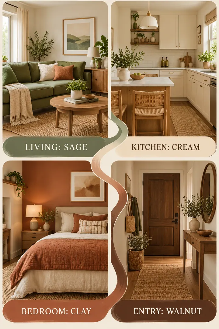
1. Repeat two anchor colors
Use the same two anchor hues in every room in different proportions, so the home feels like one place.
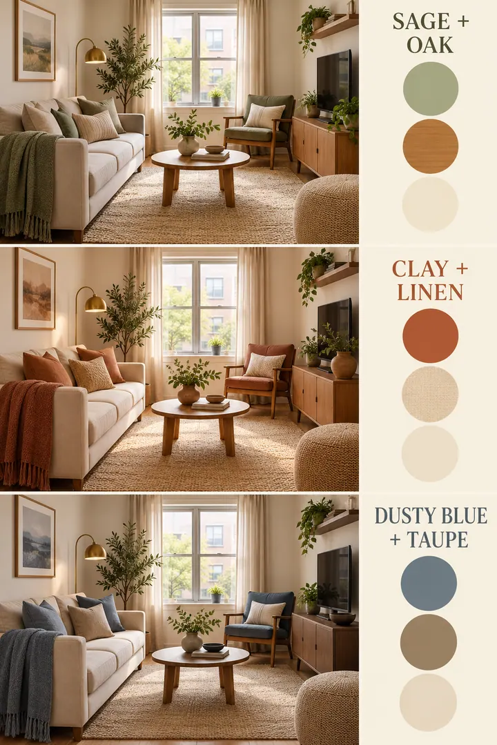
2. One dominant neutral plus two accents
Build a small living room around one neutral and two accents instead of several competing finishes.
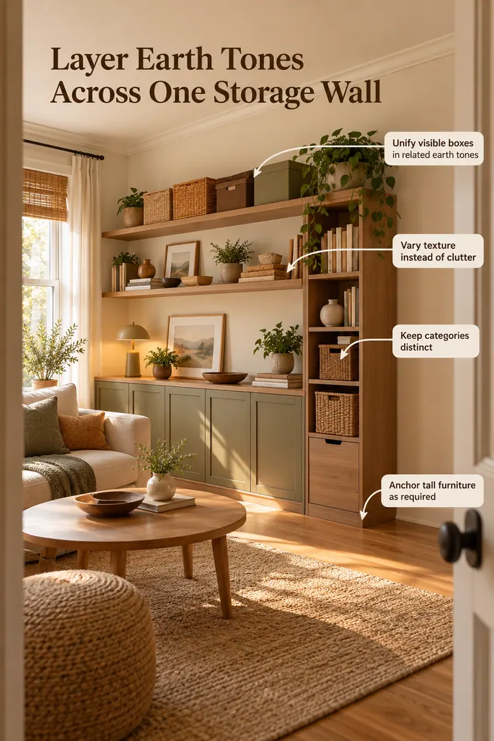
3. A storage wall in related earth tones
Visible boxes in related earth tones read as one calm wall. Vary texture instead of color.
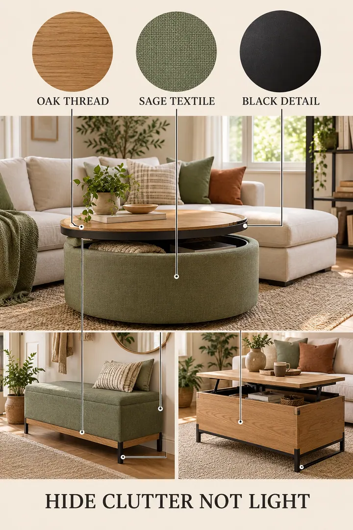
4. One wood, one textile, one metal
Repeat the same three materials across double-duty pieces so they look like a set.
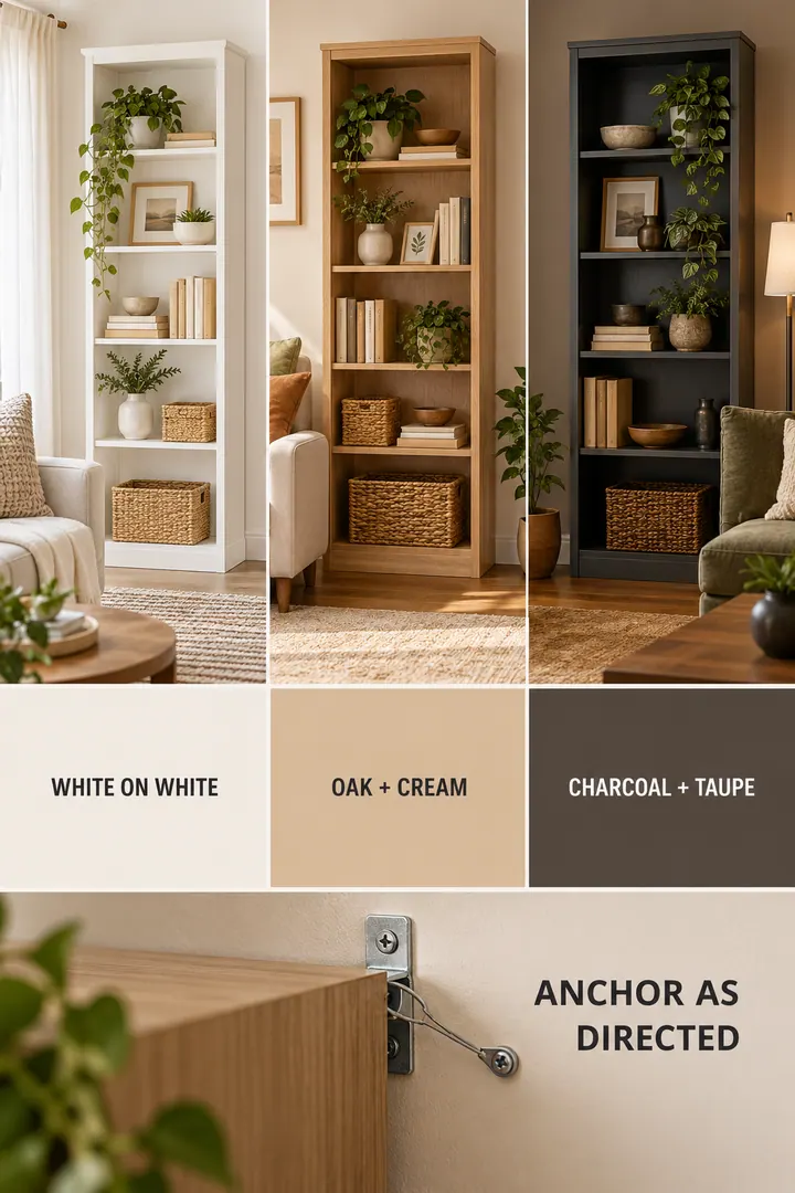
5. Match the bookcase to the wall
A bookcase in the wall color feels lighter in a small room. Still anchor it.
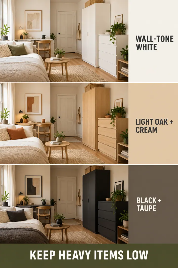
6. Blend tall storage with walls and textiles
Freestanding storage in tones that match the walls and textiles stops it dominating a studio.
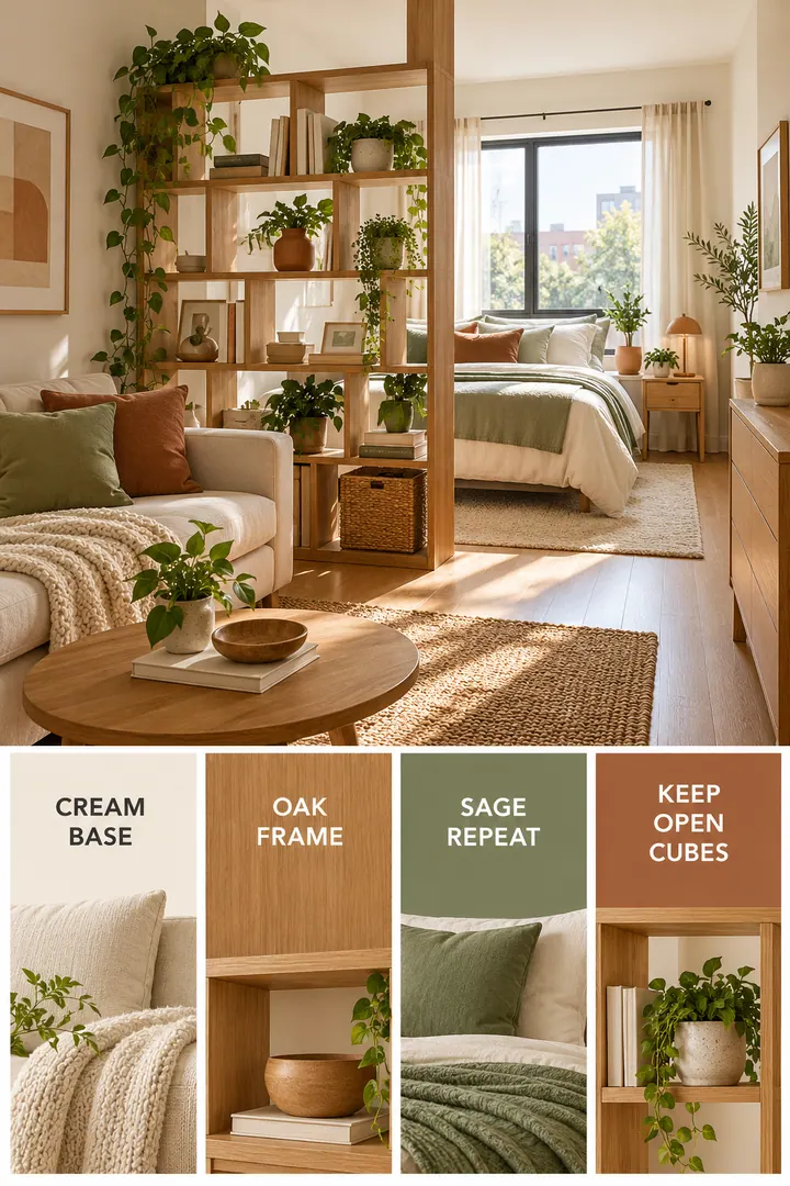
7. A divider in room colors
Open sections and colors repeated on both sides keep a divider from becoming a dark wall.
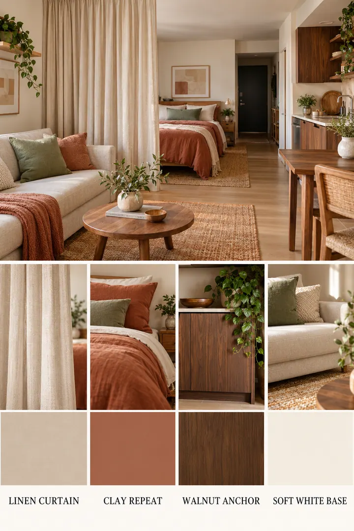
8. A curtain color repeated in the room
Pick a divider curtain color that also appears in the bedding, rug and one accent.
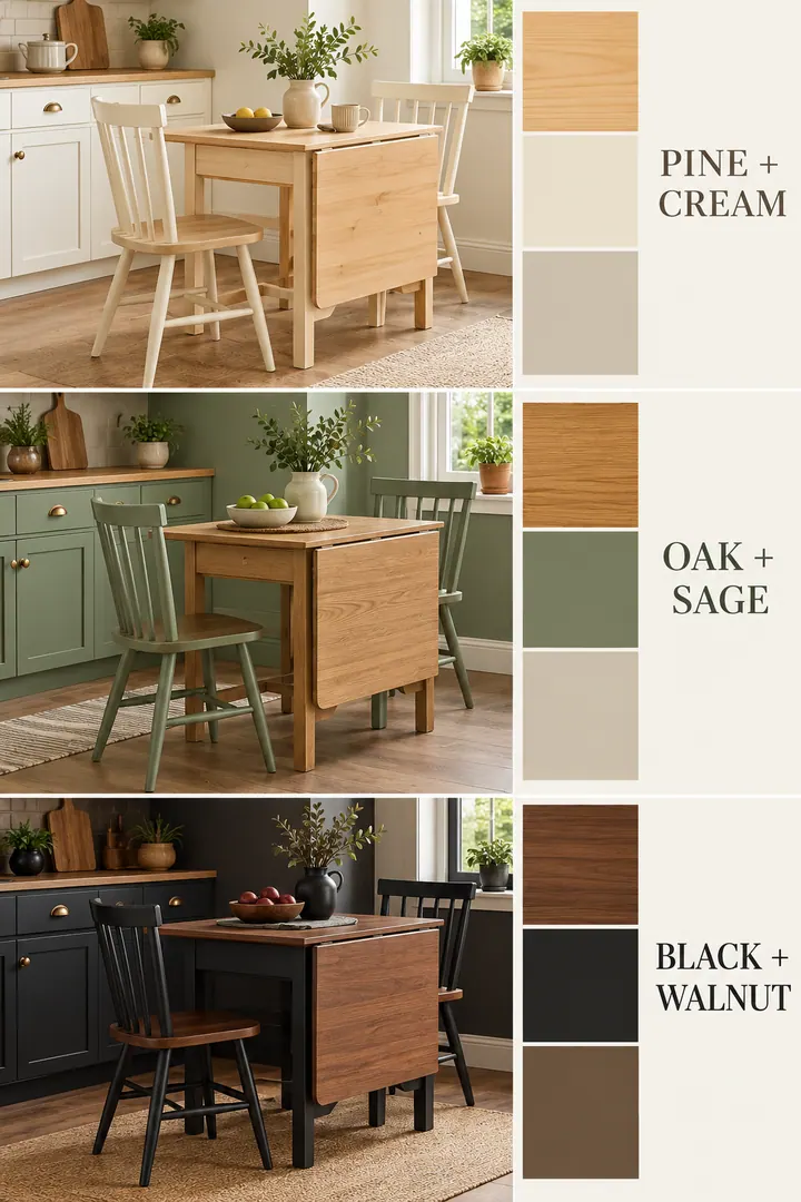
9. Coordinate the drop-leaf table
Match a drop-leaf table to the floor, cabinets and chairs so it doesn't interrupt a small kitchen.
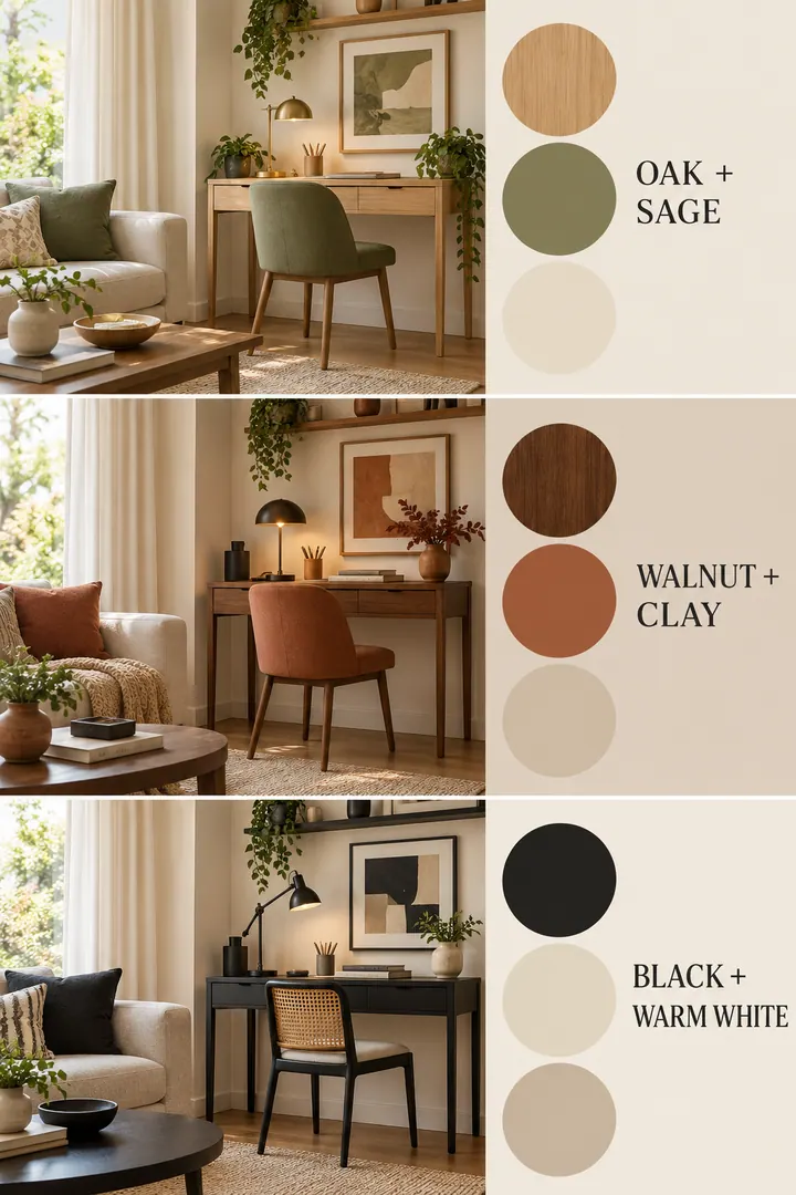
10. A desk zone that matches the living room
Repeat the living room's wood and one accent at the desk so it doesn't clash.
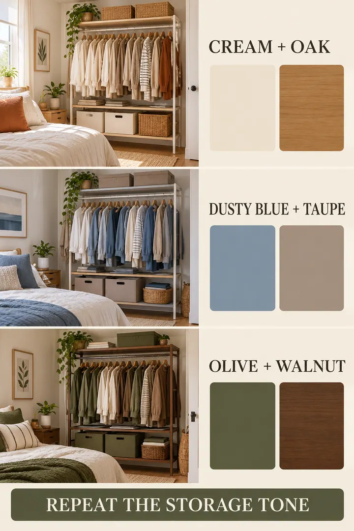
11. Uniform hangers, two storage tones
Matching hangers and storage in two tones calm an open wardrobe.
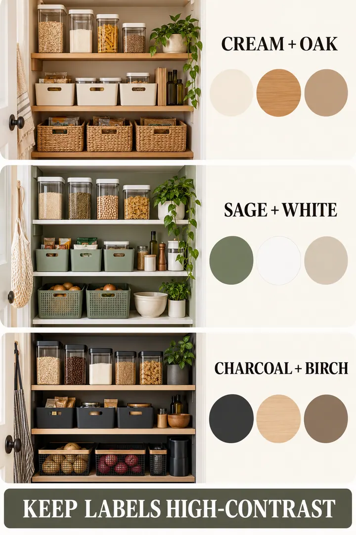
12. Three container systems in the pantry
Limit visible pantry storage to three material-color systems so the shelves look calm.
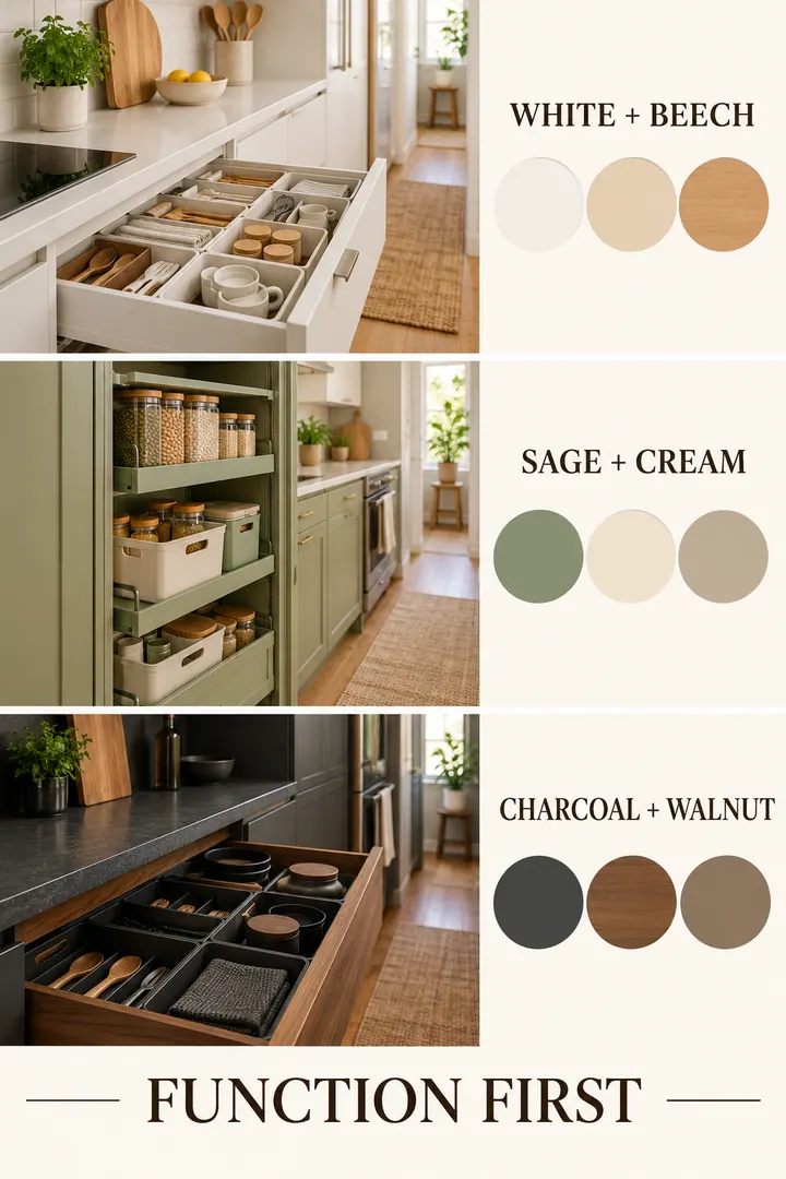
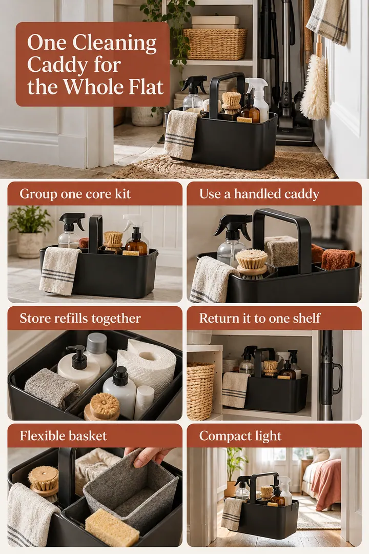
13. Organizers in counter neutrals
Match visible kitchen organizers to your cabinet and counter colors.
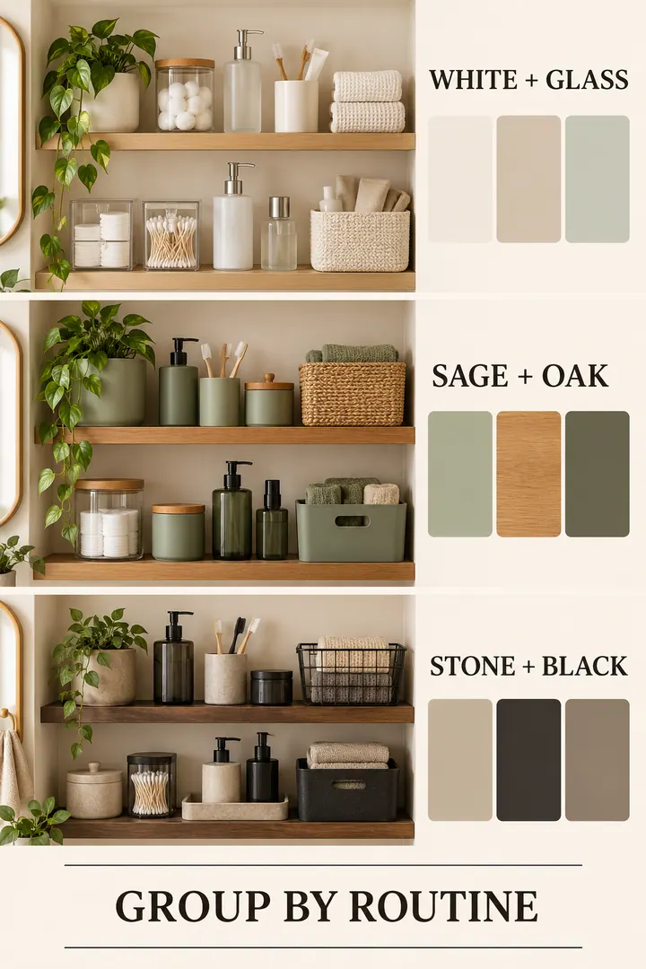
14. A limited bathroom palette
Opaque and translucent containers in one limited palette hide colorful packaging.
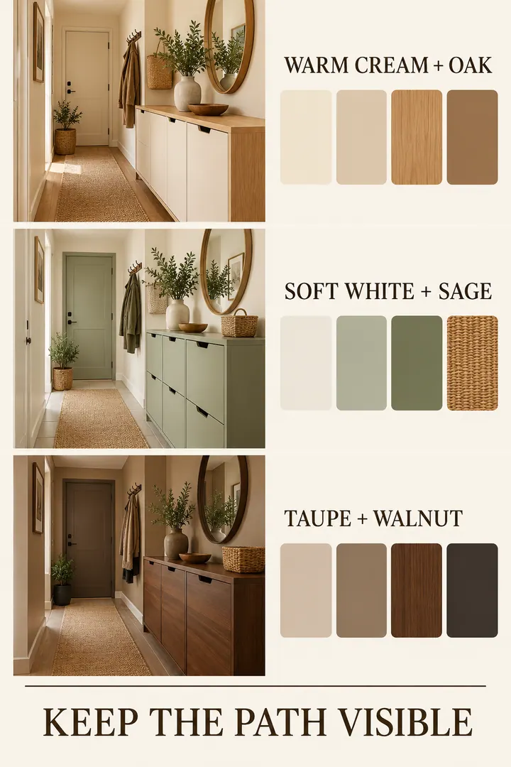
15. A restrained entryway palette
Repeat the cabinet, wall and basket tones so entry storage doesn't feel bulky.
Before you buy anything
- Before buying an organizer, check its color against your walls and furniture.
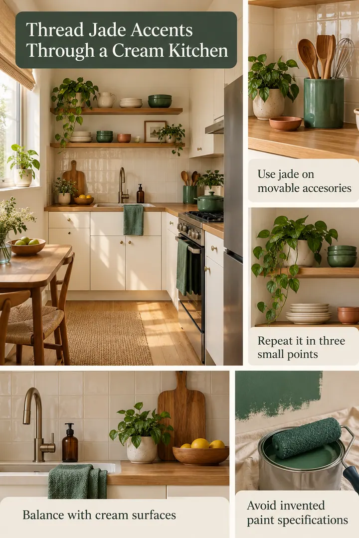
- Put accent colors on small, movable things you can change.
Questions people ask
What colors make a small apartment look bigger?
Light, related colors repeated throughout, with storage that matches the walls. Contrast in small doses only.
Should all my storage bins match?
Not exactly, but limiting visible storage to two or three colors and materials makes a big difference.